Real progress, documented as it happens.
Late July 2026
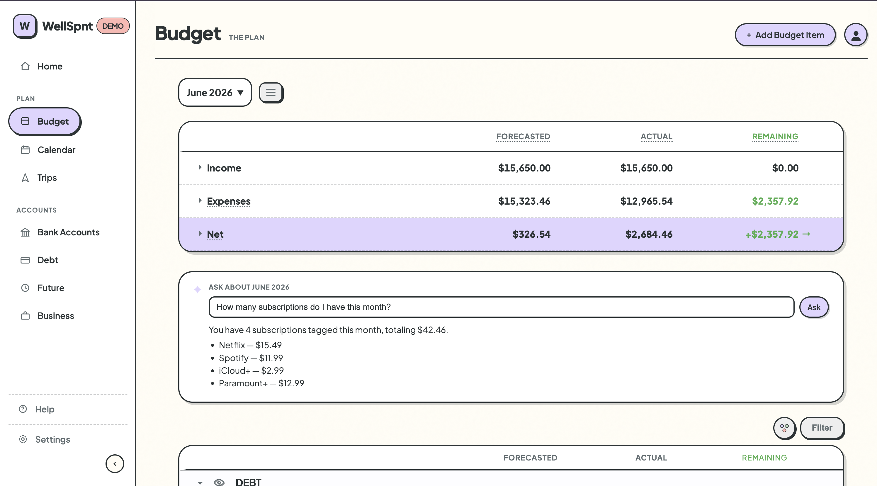
This update added the first AI features to the app. Bucket suggestions when adding a budget item, monthly spending insights on the Home page, a conversational Q&A on the Budget page, and a debt payoff simulator. All of it built on the same pattern, all of it optional.
The goal from the start was to add AI without making it the point. WellSpnt is a manual tracking app, and that isn't changing. But there are moments where a little context or a quick answer makes the experience meaningfully better, and that's where these features live.
The Bucket suggestion was the first one built, and it set the tone for the rest. The logic for categorizing a budget item lives in the app's own code as structured rules, not inside a prompt. The AI handles the explanation. That separation keeps the suggestions consistent and makes genuinely ambiguous cases honest about the ambiguity, rather than just picking a side.
Something else got removed this update too. The Close Month feature had been in the app since early on, but a closer look at what it actually did revealed a problem: it performed an irreversible balance sweep with no real safeguards. More importantly, that kind of automatic sweeping doesn't fit how WellSpnt thinks about money. Removing it was cleaner than trying to fix it.
Mid July 2026
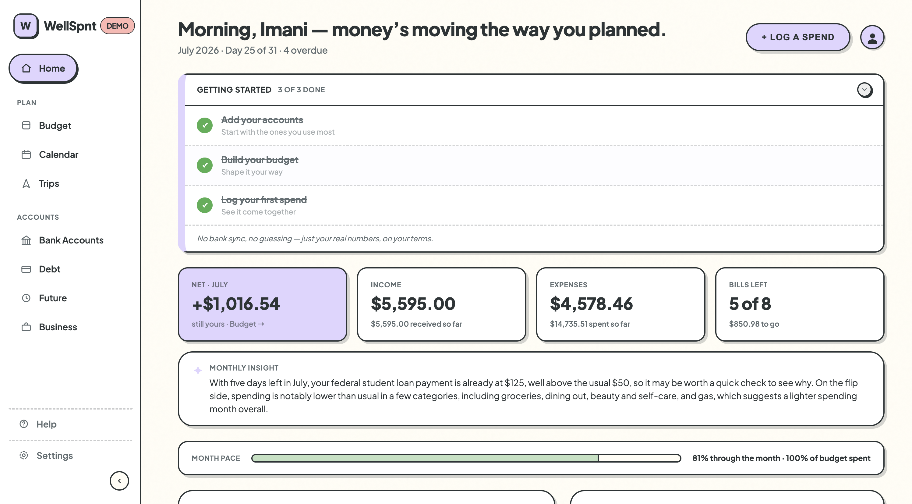
This update was about reducing friction for someone opening the app for the first time. A Getting Started checklist, page taglines, a shared account picker, and a round of real bug fixes all pushed in the same direction: less to figure out, more to just use.
A lot of small decisions came together this stretch around the idea of context. The page taglines (Budget/"The Plan", Bank Accounts/"The Reality", and so on) weren't about being clever. They were about giving each page a reason to exist before you've used it. The Getting Started checklist followed the same logic: not a tutorial, just a quiet nudge toward the right first steps.
The shared account picker was the most satisfying fix. Every place in the app where you choose an account, adding income, logging a spend, editing a transaction, was slightly different. Unifying them onto one component with consistent ordering and colored type pills was the kind of cleanup that doesn't feel like much until it's done, and then it's hard to imagine it the old way.
There were also several real bugs fixed this stretch that had been hiding behind surface-level symptoms. Popovers clipping, closing, or stretching unexpectedly. Decimal columns falling out of alignment. The fixes weren't glamorous but they made the app feel more solid.
Mid July 2026
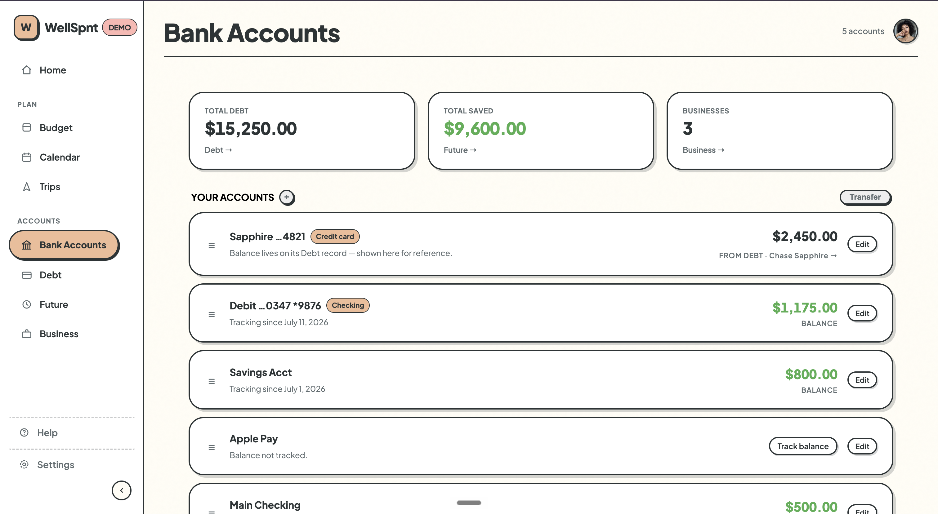
This update added Bank Accounts as a full feature, rebuilt how editing and hiding work across the app, and shipped a wide sweep of polish that touched nearly every page. It's the most complete WellSpnt has felt so far.
Bank Accounts came together in one session, which surprised me. The architecture question that took the longest to resolve was actually a small one: what does a credit card account mean in an app that already has a Debt page? The answer was that it shouldn't hold its own balance. It should just link back to the debt record that already exists. Once that clicked, everything else followed.
A lot of this session was also about replacing modals with inline interactions. Hiding a budget item, editing a future account, reordering the budget list. All of these used to open a separate modal. Now they happen directly on the page. It's a subtle shift but it makes the app feel faster and more direct to use.
Calling this v1.0 felt right not because the app is finished, but because it finally feels like something you could hand to another person and have them understand it.
Early July 2026
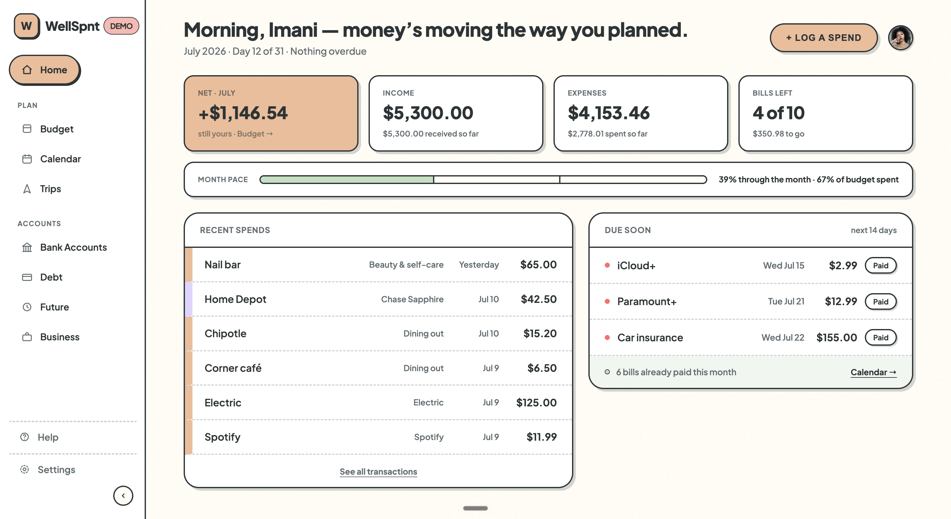
This update was mostly invisible. The codebase got reorganized, GitHub got set up, every page got a visual refresh, and a queue of well-scoped build prompts got written. Not a lot of new features, but a lot of work that makes the next ones faster.
The app had outgrown a single file. At around 2,400 lines, app.py had become hard to navigate and harder to hand off cleanly. Breaking it into smaller focused modules was overdue, and doing it carefully meant catching three real bugs that had been quietly sitting in the code the whole time.
Getting on GitHub the same week felt like the right moment. The app finally had a structure worth preserving, and a private repo means there's a real record of how it's been built.
The visual side got the same treatment. Starting with the Home page and side nav, then working through every remaining page, the whole app now shares one consistent visual language. It's the first time it's felt that way from top to bottom.
Early July 2026
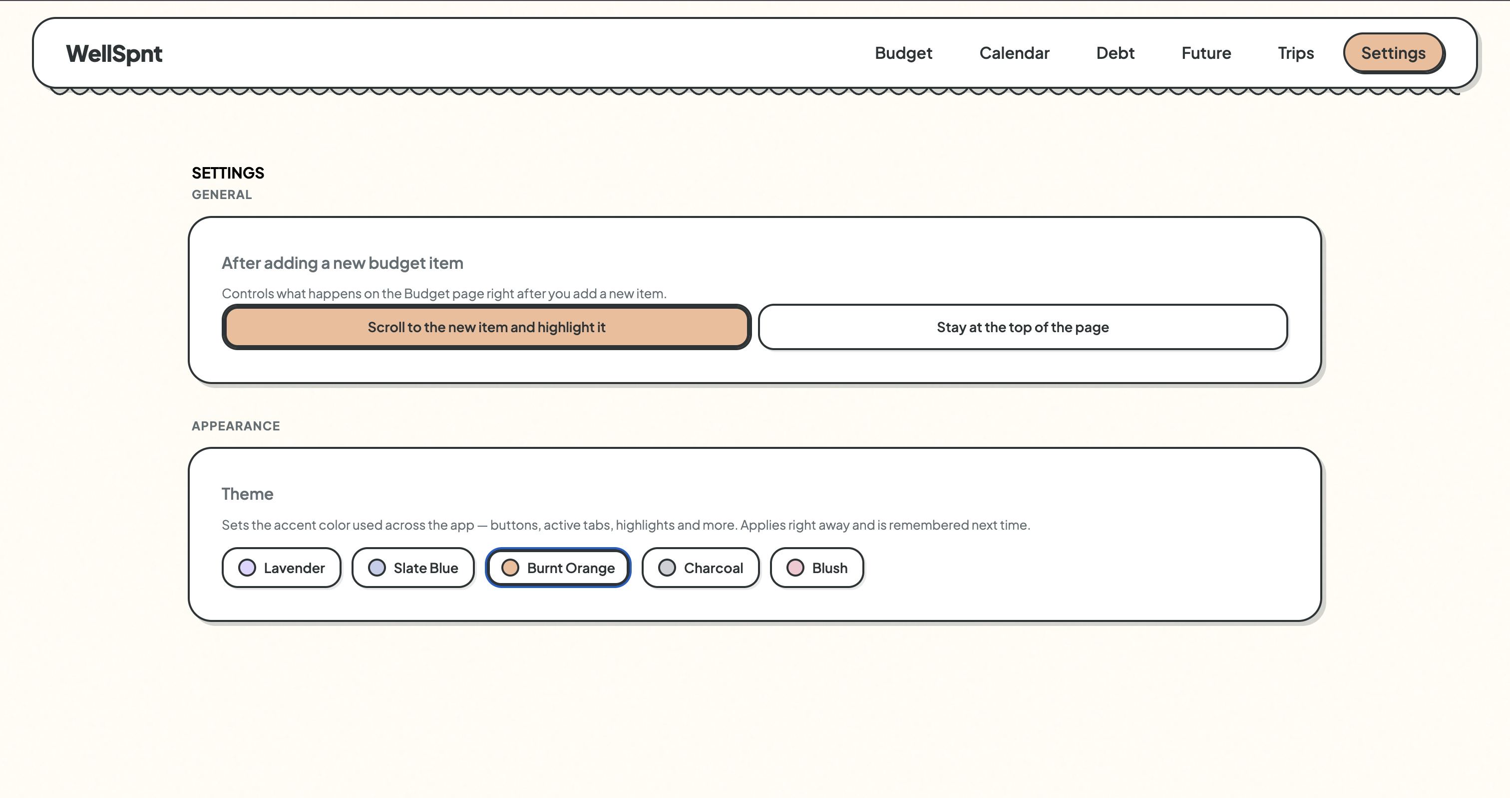
This update was about giving you more control over how the app looks, what it shows, and how you use it. A Settings page, themes, notes on budget items, and CSV export were the headline additions, alongside a lot of quiet consistency work across the whole app.
A recurring pattern this stretch was finding things that didn't quite match and bringing them in line. Forms that looked different from each other. Dropdowns rendering with default browser styling. Modals holding onto stale data. None of it is dramatic, but fixing it made the app feel more like one thing.
Money Owed to Me also found its right home. It had been sitting in Future Accounts, which never made sense. It's not a savings goal. It's more like the mirror image of debt. Moving it to the Debt page cleaned up the architecture without needing to build anything new.
The Settings page is just getting started. Themes, a scroll preference, CSV export. There's more to add over time, but having the foundation in place means future options have somewhere to live.
Late June 2026
This update added Debt as a real budget group, introduced color-coded Tags for organizing what you track, and rebuilt Future Accounts from the ground up. For the first time, all the moving parts of the app are talking to each other.
Debt had been easy to put off because it required real decisions. Once I committed to treating it as its own group with its own section on the budget page, the rest followed naturally.
The hardest part was getting the Net calculation right. Contributions to savings reduce your net. Withdrawals show up as income. That logic sounds simple until you walk through a real scenario, and walking through those edge cases before they became bugs was worth the time.
Future Accounts also got a full rebuild. Getting it right meant making sure Debt, Trips, and Future Accounts all follow the same pattern: create once on their own page, reflect automatically on the budget page. That consistency is what made the app start to feel like a system.

Late June 2026
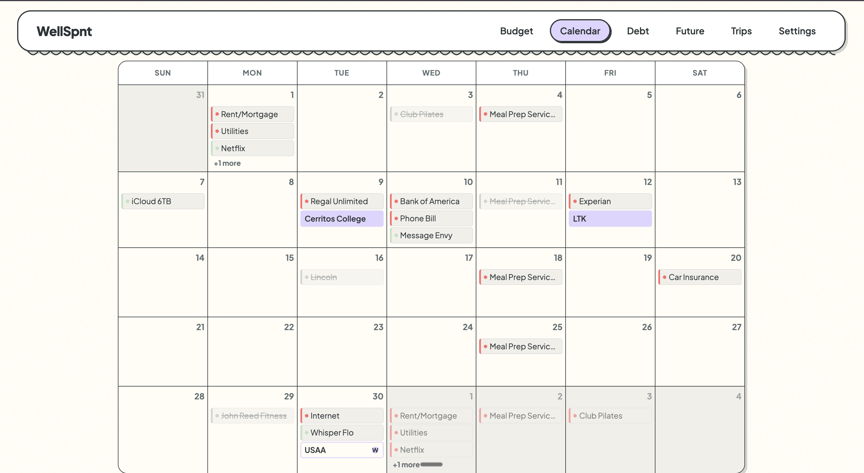
This update brought more flexibility to how you manage what you track. Categories got a cleaner structure, Trips became a real feature, and the calendar started showing the full picture of your money month.
Real life doesn't follow a clean monthly budget. Bills get skipped. Travel spending doesn't fit neatly into a category. Income shows up on a different day than expected. This update was about making the app handle all of that honestly.
Skip ended up being the trickiest piece to get right. The first version would have skipped every occurrence of a weekly bill for the whole month, which isn't how anyone actually lives. Keeping it on the calendar and scoped to one date at a time made it feel correct.
Trips went from a vague idea to a full feature with its own page, transaction linking, and a clean list and detail view. It's the first time WellSpnt has had something that lives completely outside the monthly budget.
Late January 2026
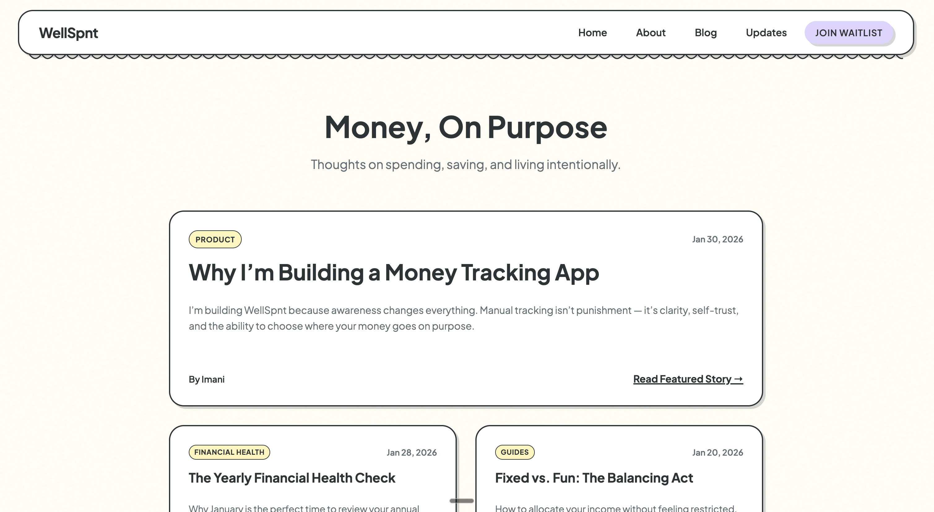
This update focused on shaping how WellSpnt is explained and experienced outside the app. A simple marketing site took form, designed to reflect the same calm, clarity, and intention as the product itself.
As the app became more defined, it became clear that the website needed to do more than list features. It needed to explain why WellSpnt exists and who it's for.
This work focused on tone, pacing, and reassurance, making sure the site felt calm, honest, and aligned with the idea of awareness over pressure. Copy was refined, layouts were simplified, and the experience was shaped to feel more like a journal than a sales page.
This update laid the groundwork for future writing, updates, and launch communication.
Late January 2026
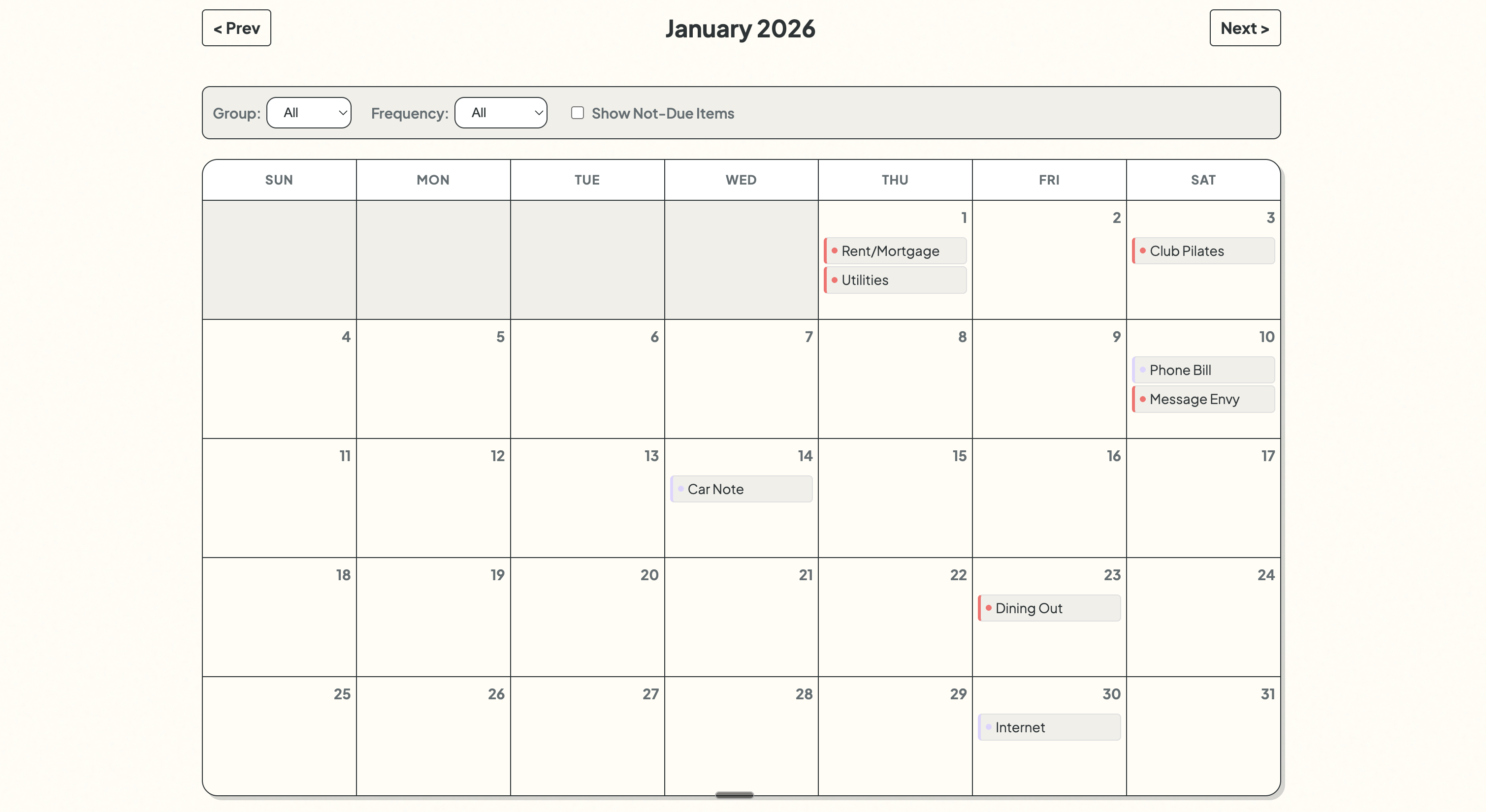
This update introduced a calendar view, making it easier to see how money moves across days and weeks. Spending stopped feeling like isolated numbers and started to feel connected to real life.
Before this update, money lived mostly in lists and totals. Adding a calendar made it possible to see when things happen, not just how much.
Seeing spending laid out over time helped reveal patterns that were easy to miss before, like busy weeks, quiet stretches, and moments where habits repeat. This wasn't about adding complexity, but about giving context.
Time is a big part of how we experience money, and this update helped bring the two closer together.
Late January 2026
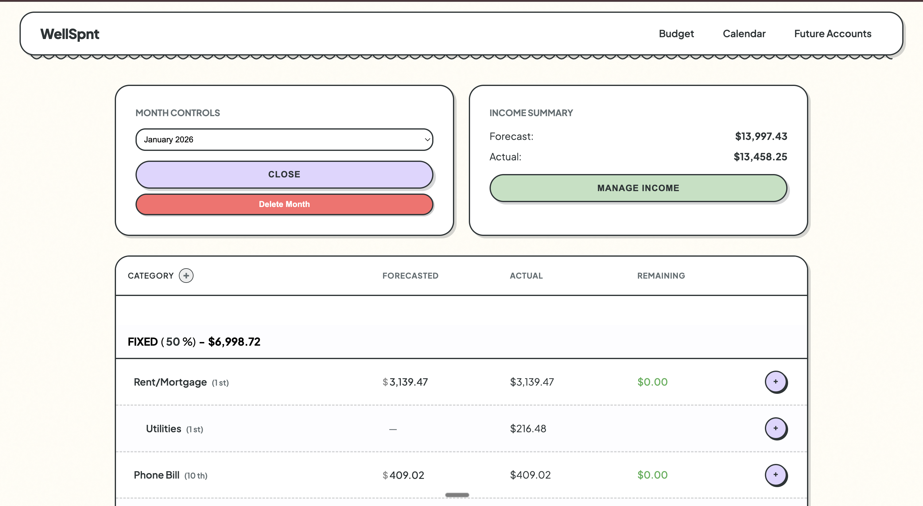
This update marked a shift in how WellSpnt looks and feels. The interface moved toward a calmer, more intentional visual language designed to make money feel less overwhelming and more approachable.
At this stage, the app worked. It just didn't feel right yet. I explored new visual references and realized the design needed to feel softer, slower, and easier to sit with.
This redesign wasn't about making things flashy. It was about creating space, reducing visual noise, and letting the numbers breathe so they're easier to understand at a glance.
This shift set the tone for everything that followed.
Late January 2026
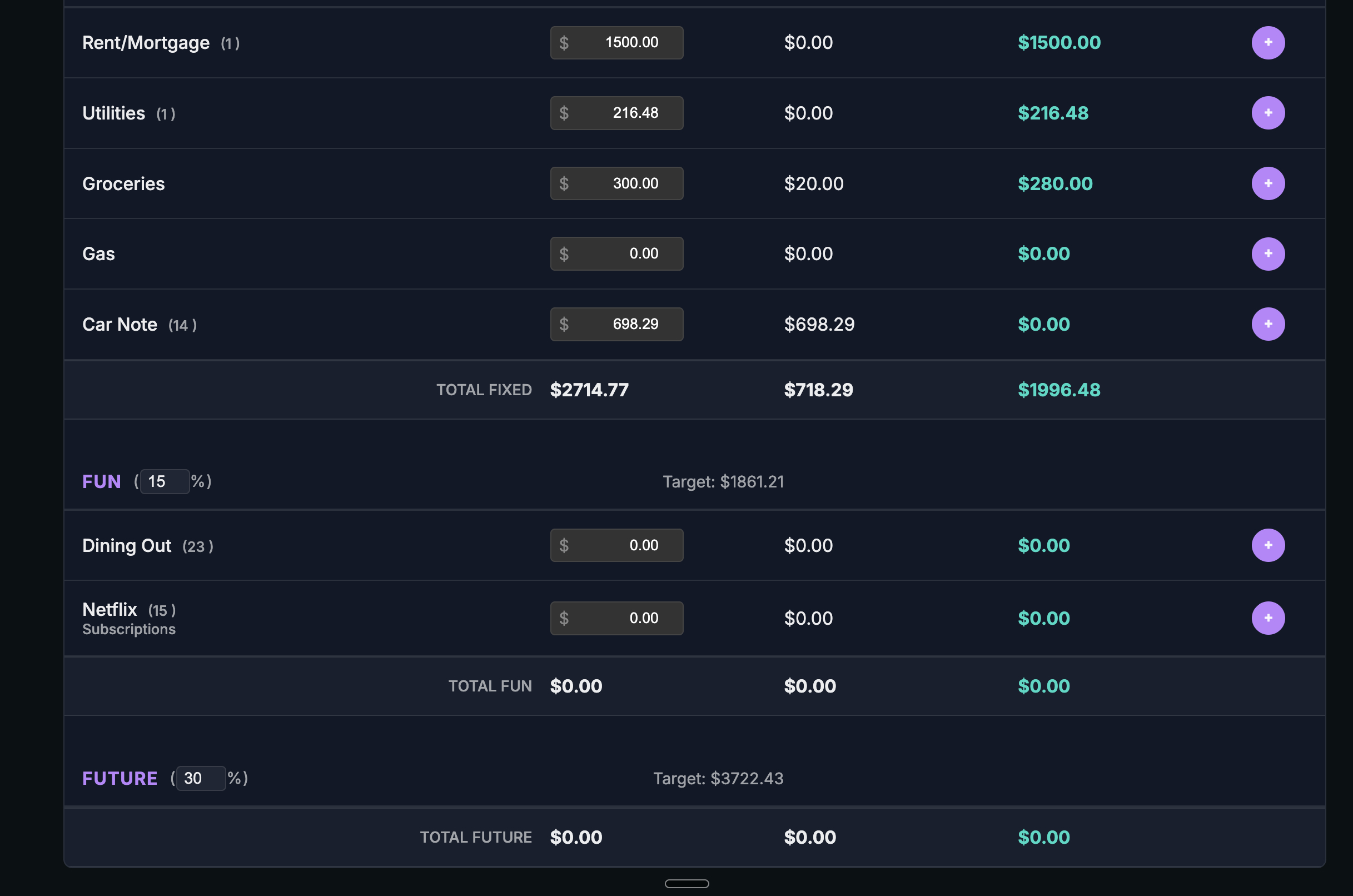
This update focused on making savings feel clear instead of confusing. WellSpnt now separates money saved this month from your total savings over time, so you always know what's new and what's already been set aside.
Savings used to blur together in a way that didn't feel intuitive. This update clarified two different ideas: money you're intentionally setting aside right now, and money you've already saved over time.
Once that distinction was clear, the rest of the app started to make more sense. This change was less about adding features and more about aligning the app with how people naturally think about future money.
Late January 2026
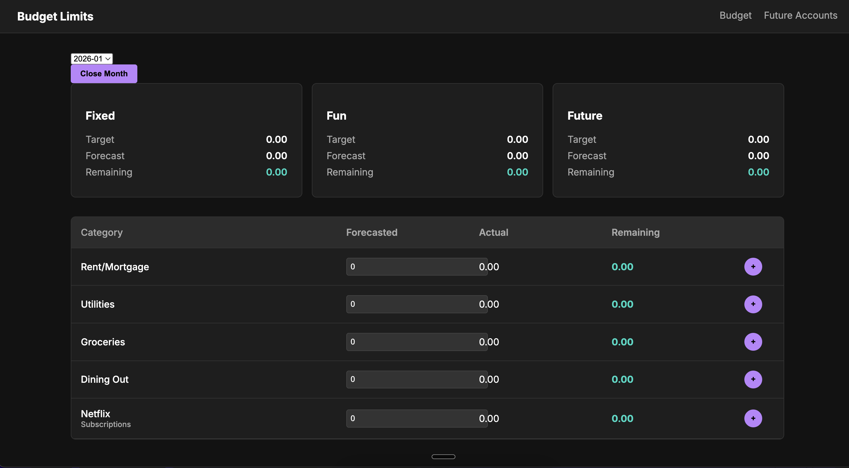
This was the first real stretch of building WellSpnt. The focus was on getting the core of the app to exist in a way that felt usable, not perfect.
I built the basic structure for entering and grouping money, and shaped an early interface that could handle everyday tracking. It doesn't replace spreadsheets yet, but this was the moment the app started to feel real.
 WellSpnt